Religiosity vs. GDP: A Regression That Passed Every Check — and a Causal Story It Can't Tell
📍 Statistics for Social Sciences 📅 July 13, 2026 · 9 min read
A regression assignment taught me that the model passing every check is precisely the moment to stop trusting the story it seems to be telling.
What follows is a walk-through of a graduate applied-statistics assignment: a simple linear regression of national GDP on a country-level religiosity score. The numbers are real R output. The caution at the end is the actual point of the exercise.
Somewhere, right now, someone is turning a scatterplot into a headline. Two variables move together, a line gets drawn through the cloud of points, and by the time the chart reaches a feed it has quietly upgraded itself from these two things are correlated to one of them explains the other. I know the move because this assignment handed me the raw material to make it myself, and the model I built was clean enough that making it would have been easy.
The setup
The dataset paired two variables across 44 countries: a religiosity score and GDP, reported in U.S. dollars. The assignment moved in a fixed sequence, each step quoted here as it was assigned:
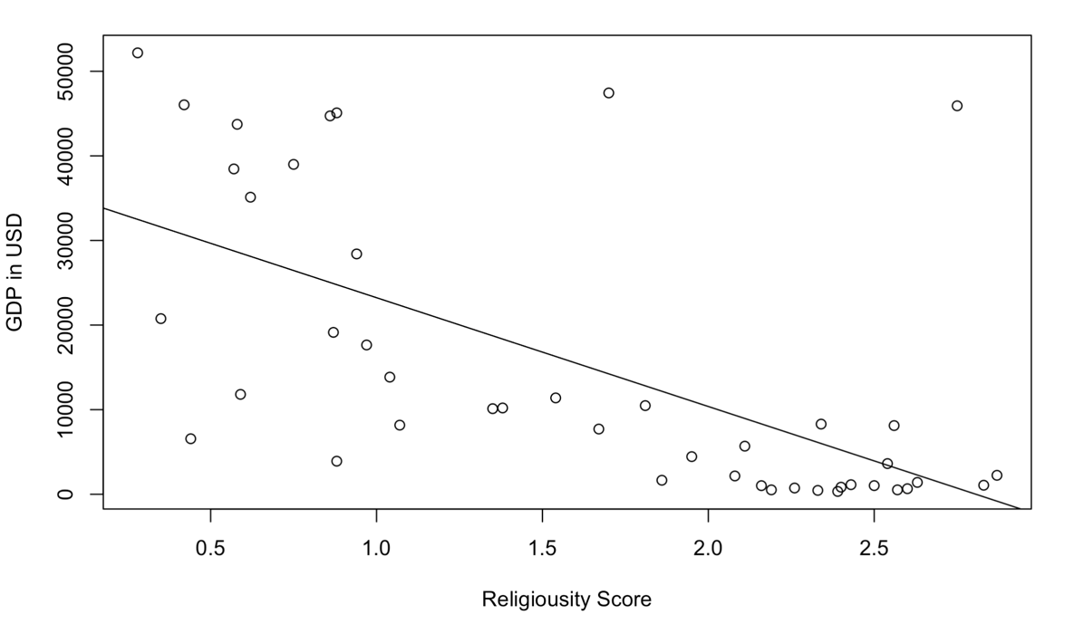
(2 points) Use R Studio to generate a scatterplot with a line that is going through the data. Set Religiosity as the independent variable and GDP as the dependent variable… This is one way to assess the assumption of linearity for linear regression.
The eye finds the pattern before the statistics do: as the religiosity score climbs, GDP drops. That’s the shape everyone reaches for when they want a chart like this to mean something.
The framework — check before you believe
The assignment doesn’t let you stop at the picture. It forces a sequence, and the sequence is the actual lesson:
- Look at the relationship — the scatterplot, to check the shape is roughly linear before fitting anything to it.
- Test whether the correlation is real — not just present in this sample, but unlikely to be a fluke of which 44 countries got sampled.
- Fit the model and read what it claims — a slope, a confidence interval, a variance explained.
- Check whether the model is allowed to say those things — residual diagnostics, because a regression’s p-values only mean what they claim to mean if its assumptions hold.
- Only then ask what the model is being used to argue — and whether the data can actually carry that argument.
Steps 1 through 4 all came back clean. Step 5 is where I nearly let the story get away from me.
The numbers, in order
(1 point) Use R to generate the sample correlation coefficient between Religiosity and GDP… Does the direction of the association agree with the scatterplot?
The correlation was r = -0.62 — moderately strong, and negative, matching the downward slope by eye.
(2 points) You would like to test if there is a significant correlation between Religiosity and GDP. Use the cor.test() function.
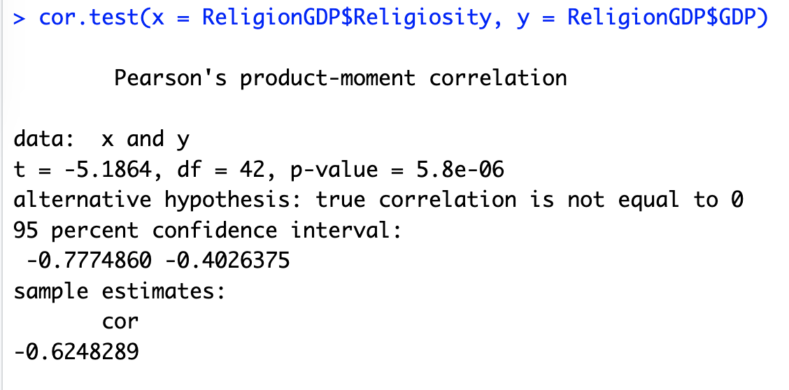
t = -5.1864 on 42 degrees of freedom, p = 5.8e-06 — nowhere close to the 0.05 line. Against the null hypothesis (H₀: ρ = 0, no correlation in the population), the alternative holds: this correlation is not sampling noise.
(2 points) Generate a simple linear regression model in R Studio using GDP as the dependent variable and Religiosity as the independent variable.
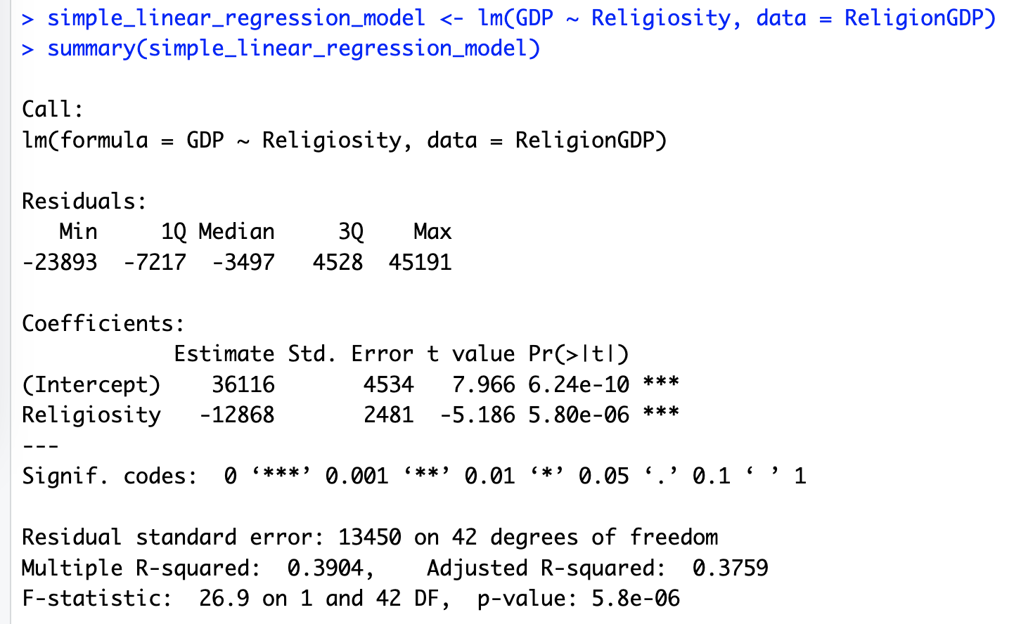
The model: for every one-unit increase in the religiosity score, predicted GDP drops by $12,868. The slope is significant (p = 5.80e-06), the whole model is significant (F = 26.9, p = 5.8e-06), and the adjusted R² is 0.3759 — the model accounts for roughly 38% of the variation in GDP across these 44 countries.
Then the diagnostics, which is where most people stop reading and I was told not to:
(3 points) Explore whether the residuals are normally distributed by generating a normal quantile-quantile plot and a histogram of residuals. (1 point) Run the Kolmogorov-Smirnov Test of Normality… was the assumption of normality satisfied?
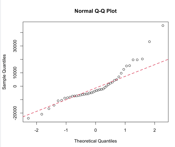
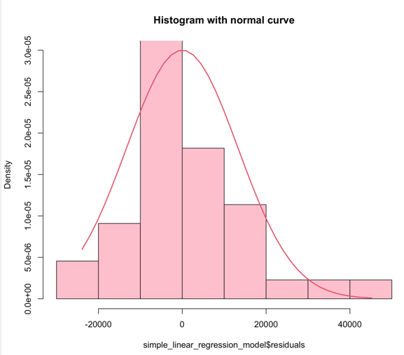
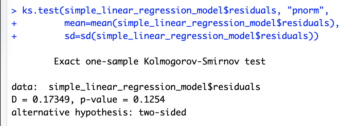
D = 0.17349, p = 0.1254 — above 0.05, so normality holds.
(1 point) Assess whether the scatter of the residuals around the fitted line has an equal variance, using the Score Test for Non-Constant Error Variance.
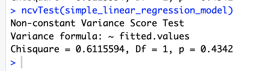
p = 0.4342 — no evidence against constant variance. Homoscedasticity holds too.
By every check the assignment asked for, this is a well-behaved model. That’s not a small thing — a lot of regressions fail exactly these tests and get reported anyway. This one didn’t need to be forced.
The line I almost let stand
Here’s the honest defect, and it’s mine, not the model’s. Question 11 asked me to interpret the slope “in context.” My first-draft answer read: for every one-unit increase in Religiosity, we expect a decrease of 12,868 units in GDP, given other factors remain constant.
That last clause is boilerplate — the standard way you’re taught to narrate a regression coefficient — and it’s wrong here. “Other factors remain constant” is a sentence that only means something in a multiple regression, where there are other predictors in the room being held fixed while one moves. This is a simple linear regression. Religiosity is the only predictor. There are no other factors in the model to hold constant, because none were ever measured. I’d copied the standard phrasing out of habit and let it sit in a paper it didn’t actually apply to — the same instinct that makes me re-explain a word mid-sentence at work almost caught it, but not on the first pass.
It’s a small correction. It also names exactly what the model can and can’t claim: it describes a linear association between two variables in this sample of 44 countries, nothing about a third variable being controlled, and — this is the part that matters — nothing about which one is moving the other, or whether either one is moving the other at all.
What the clean model doesn’t rule out
A significant negative slope, 38% of variance explained, and both diagnostics passing is exactly the profile of a chart that’s about to get misused. “More religious countries are poorer” reads, to most people, one inferential step away from “religion causes poverty” or its mirror, “poverty causes religion” — a debate people already have strong priors about, which makes a clean regression like this one dangerous precisely because it looks rigorous enough to end the argument.
It can’t end the argument, for reasons the model itself can’t see:
- It’s observational and cross-sectional. One snapshot in time, no manipulation, no random assignment of religiosity to countries. Regression doesn’t know the difference between predicts and causes — that distinction has to be argued for outside the model, and this assignment never asked me to.
- Religiosity is plausibly a proxy, not a cause. National religiosity scores correlate with development stage, education levels, urbanization, and secularization patterns that move together as economies industrialize — the “secularization thesis” that’s been argued in sociology for decades. A regression with one predictor can’t distinguish “religiosity lowers GDP” from “religiosity is a downstream marker of the same historical process that also produces higher GDP.”
- 44 countries is not a lot of countries. Enough to detect a real correlation, not enough to rule out that a handful of unusually rich, unusually secular countries — or unusually poor, unusually religious ones — are doing most of the work in that slope.
- 61% of the variance is still unexplained. Adjusted R² of 0.38 means the majority of what determines a country’s GDP isn’t in this model at all. A single-predictor regression that explains well under half the variance is not a complete theory of anything; it’s one correlated variable among many uncounted ones.
None of this makes the regression wrong. The correlation is real, the slope is real, the diagnostics are clean. What it doesn’t have — and what no amount of clean diagnostics can manufacture — is a causal story. That has to come from theory, from a research design built to isolate it, or from data this assignment never collected.
What transfers
My throughline is negotiating for clarity, and I usually apply it to a sentence someone half-heard in a meeting. This assignment applied it to a chart instead: negotiating for clarity here meant being precise about what a passing model actually proves — an association, a direction, a magnitude, all conditional on this specific sample — and refusing to let it quietly answer a bigger question it was never built to answer. A model that passes every check you run on it is still only answering the questions you asked it. The confidence in the answer and the confidence in the story built on top of it are two different things, and it’s worth checking which one you’re actually holding before you repeat it.
Thanks for reading. Next time a scatterplot with a clean line through it crosses your feed, it’s worth asking: what would this chart look like if the causal arrow ran the other way — and would you be able to tell?
Comments