MGNREGA: The Regression That Held — and the State Where the Budget Line Goes to Zero
📍 Statistics for Social Sciences 📅 July 11, 2026 · 12 min read
Data tells stories, but what if there's no data? Working on dataset of India's rural jobs guarantee scheme taught me that a strong correlation is a responsibility, not a headline.
My final project asked me to analyze any large dataset and come to defensible conclusions — no more, no less. I picked real Indian government open data on a national rural employment scheme. What follows is that analysis, the live political dispute sitting inside it, and the one sentence in my own paper I had to go back and hold to a higher standard than the rest.
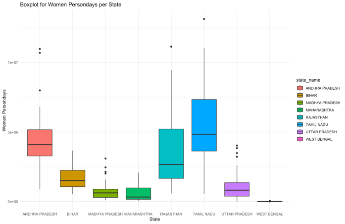
Look at the boxplot above. Seven states show a familiar shape — a box, a median line, some whiskers, some outliers reaching toward a good year. The eighth state is a flat line sitting on zero. That’s not a data error. That’s what happens to a public guarantee when the money that funds it stops moving, and it’s the finding my final graduate paper spent ten pages trying to earn the right to say carefully.
What MGNREGA promises
The Mahatma Gandhi National Rural Employment Guarantee Act became law in India in 2006. It’s a genuinely unusual piece of legislation: a legal right to work, guaranteeing at least 100 days of paid manual labor a year to any rural household that wants it, in every Indian district except the fully urban ones. Women are guaranteed one-third of the jobs created. If the government can’t provide work within fifteen days of a request, it owes the worker an unemployment allowance instead. It’s been recognized by the Bill & Melinda Gates Foundation and cited internationally as one of the more serious social-security laws on the books anywhere — and during COVID-19, it sustained a rural workforce larger than the population of North America.
That’s the promise. My final project tested one narrow, specific piece of the machinery that’s supposed to deliver it: does the government actually approving the labor budget predict whether women get the paid workdays the law guarantees them.
What the assignment asked for
The prompt I had set out to answer was deceptively simple, leaving immense room to wander:
For the final project you are to analyze a dataset and write up your results in a brief report… The project is intended to be an application of the skills you have learned in this course in a less structured setting than in an exam or a problem set.
The instructions also noted that formal citations weren’t strictly required — an omission I used as license to go looking for sources nobody was going to grade me on:
You do not need to include citations in your paper, since the goal is for you to learn how to conduct and report results from a data analysis rather than write a literature review.
But the grading rubric’s Conclusion section left one open-ended constraint that I kept returning to while writing:
Is there any discussion of potential limitations or qualifiers to the findings?
The data
I sourced the dataset myself from data.gov.in, India’s Open Government Data platform — the “District-wise MGNREGA Data at a Glance” release from the Ministry of Rural Development, covering April through August 2023. 740 districts, 31 variables, no missing values. I focused on two: Approved Labour Budget and Women PersonDays — the actual count of paid workdays that went to women in that district — both reported in lakhs of Indian rupees or persons (1 lakh = 100,000; roughly $1,200 USD per lakh at the time).
For reliability, I split the 740 districts into two independent groups and ran every test on both: NREGA_TOP8_POPULATED (318 districts across India’s eight most populous states) and NREGA_TOP8_POPULATED_NOT (the remaining 422). If a relationship only showed up in one subset, that would be a reason to distrust it.

It showed up in both. r = 0.817 in the top-8 states, r = 0.863 in the rest — both strong, both positive, both far past the threshold to reject the null hypothesis of no correlation. Approved budget and women’s paid workdays move together, consistently, across two independently drawn samples of Indian districts.
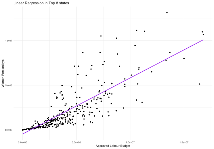
The regression sharpened it into something with a size, not just a direction:
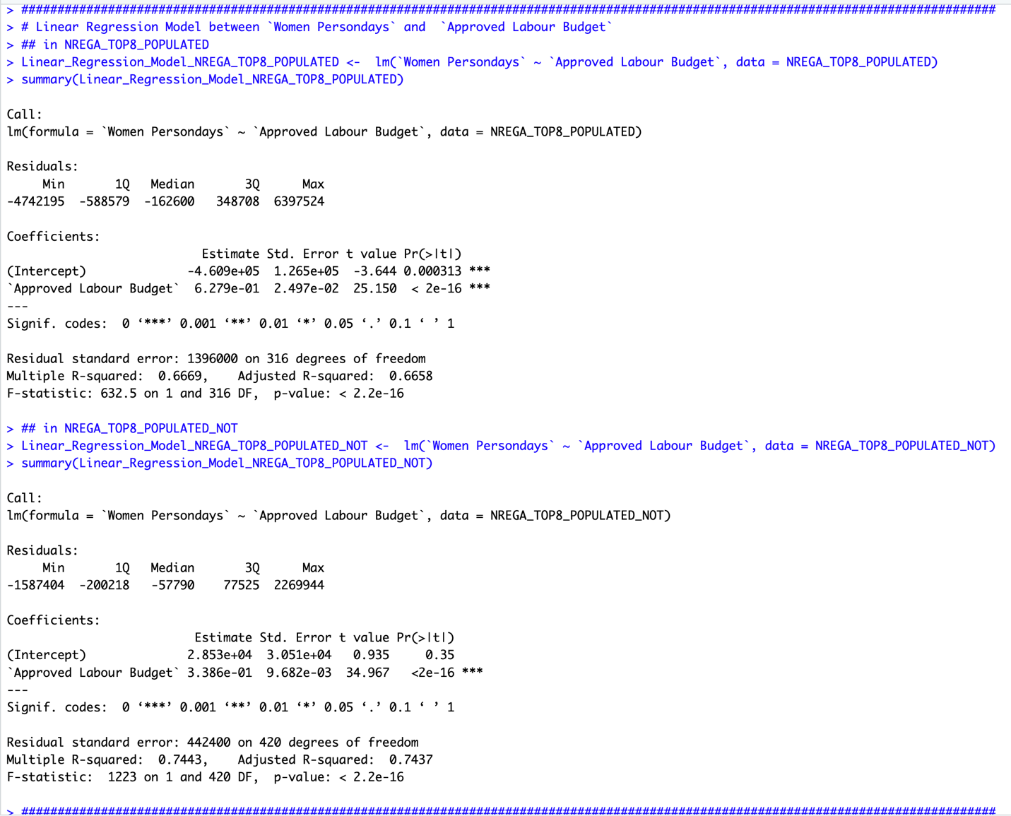
In the eight most populous states, every additional unit of approved labor budget predicted 0.628 more units of Women PersonDays, and the model explained 66.7% of the variance. In the rest of the country, the slope was smaller (0.339) but the fit was tighter — 74.4% of variance explained. Both relationships were significant well past any reasonable threshold.
The state where the line stops
Then I broke the same two variables out by state, and the boxplot at the top of this page did more explanatory work than either regression. Seven states show a normal spread. West Bengal is the flat line.
West Bengal is the only state impacted by an ongoing funding freeze. The Union government halted MGNREGA wage disbursement to the state, citing misuse of funds and corruption; the West Bengal state government has called the timing political, tied to panchayat (village-level) elections, and argued the Centre cannot lawfully withhold payment for work already completed. The last wage installment reached workers on December 26, 2021. Everything after that is the flat line in the chart above.
The mechanism is visible one plot earlier, in the variable that’s supposed to cause it:
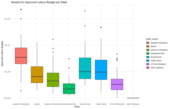
Same shape. Same state. Approved budget goes to zero, and — consistent with everything the regression predicted — women’s paid workdays go to zero with it.
The dispute has a paper trail. In September 2022, the Paschim Banga Khet Mazdoor Samity (a West Bengal agricultural workers’ organization) petitioned the Kolkata High Court for release of pending wages, and the court directed state district commissioners to respond; a further petition followed. In June, the state government produced a letter from the Centre, dated March 9, 2022, invoking Section 27 of the NREGA Act — the provision letting the central government block funds over non-implementation or documented misuse — and alleging the state hadn’t complied with directives on running the scheme properly. By the Union government’s own account to Parliament, it was withholding over Rs 7,500 crore (roughly $900 million, at the conversion rate my paper used elsewhere), and West Bengal was owed Rs 5,433 crore (roughly $652 million) — more than half of everything the central government owed to every state combined. Trinamool Congress leader Abhishek Banerjee characterized the freeze as deliberate, tied to the BJP’s loss in West Bengal’s 2021 state election. That’s the live political conflict sitting underneath a flat line in a boxplot.
Data tells stories, but what if there’s no data?
This same story shows up a second time in my own research, from a different angle entirely. Working with this same government data, I built out a broader exploration — full correlation matrices, close to thirty variables at a time, clustered and color-coded, one heatmap per state — and posted a short screen capture of it cycling through: Andhra Pradesh, Himachal Pradesh, Maharashtra, Telangana, Uttar Pradesh, and on down the list.
Watch the states cycle and you’ll notice one is conspicuously missing. West Bengal never appears. Not because I skipped it — its underlying metrics were too incomplete to build a matrix at all. My caption on that post at the time: “Data tells stories, but what if there’s no data?”
It’s a different failure mode than the one the boxplot shows, and worth being precise about the difference. The final project’s numbers say West Bengal’s approved budget and women’s paid workdays both collapsed to near-zero — the data exists, and it says almost nothing happened. The correlation matrix says something quieter: for a full statistical picture across two dozen-plus variables, the reporting itself broke down before a single coefficient could be computed. Two independent looks at the same government’s data, using different methods and different variable sets, both arrive at West Bengal being the one state the data can’t fully speak for — one because the number is zero, the other because there’s no number at all.
Reading my own diagnostics honestly
I generated the assumption checks the course required — residuals against fitted values, and a Q–Q plot for normality — for both subsets. Neither is clean, and I want to say that plainly instead of glossing past it:
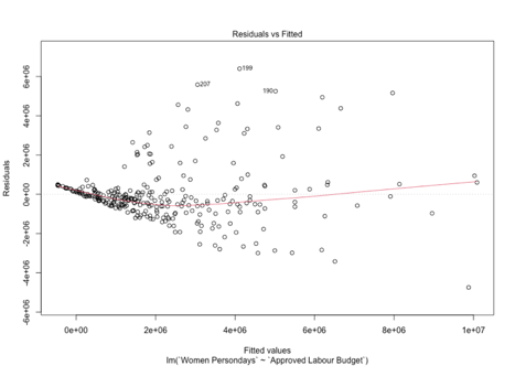
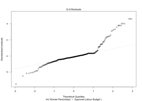
That funnel shape is heteroscedasticity — the model’s errors get bigger, not steadier, as approved budget increases, which means my confidence intervals are more trustworthy for small-budget districts than large ones. The Q–Q plot’s upward curl at the tail says the same thing from a different angle: a handful of high-budget districts are behaving in ways a straight line doesn’t fully capture. My Discussion section’s stated limitations were generic — “the model assumes linearity,” “other unobserved factors may influence the relationship” — true, but written before I’d actually looked hard at what the diagnostic plots themselves were showing. The generic caveat and the specific pattern in front of me were not quite the same admission, and it took going back to notice the gap between them.
There’s a second, sharper instance of the same gap, and it’s the one I’m least proud of. In the descriptive results, I wrote that Tamil Nadu led every state in Women PersonDays despite ranking only third in Approved Labour Budget, and attributed it to “the state government’s practice of prioritizing women-led households under MNREGA.” That may well be true — but nothing in a cross-sectional correlation between two statewide averages tests it. It’s a specific causal mechanism, stated with the confidence of a finding, sitting four paragraphs before a Discussion section that correctly warns readers the model “captures associations but does not imply causation.” I wrote the caveat. I also wrote past it once, for the one result that had a satisfying story attached. That’s the instinct worth naming out loud: the sentence most likely to slip past your own review is the one you already wanted to be true.
What the correlation doesn’t get to say
The honest reading of this data: approved labor budget is a strong, consistent, statistically significant predictor of women’s paid workdays under MGNREGA, replicated across two independent samples covering all 740 districts, and West Bengal — the one state where that budget line was deliberately cut — shows the lowest values for both variables in the entire dataset. That’s what the numbers support.
What they don’t support, on their own, is the causal story sitting right behind them and much easier to reach for: that the Centre’s freeze caused the collapse in women’s employment, full stop, no other factors. The regression can’t rule out reverse causation, confounds, or the fact that this is one snapshot in time with no before-and-after comparison built in. What makes West Bengal different from a purely statistical argument is that the mechanism isn’t hidden in a coefficient — it’s on the record, in a government letter citing Section 27, in a Parliament response naming a rupee figure, in a court petition with a date on it. The correlation and the documented policy action point the same direction. I still don’t get to write the sentence as if the scatterplot alone proved it.
One more source shaped this paper without ever making it into the citation list. Reading around the topic — well past anything the assignment required — I kept coming back to Thapar-Björkert, Maiorano, and Blomkvist’s 2019 study on empowerment mechanisms among women and Dalits under MGNREGA. Their argument, in short: more paid workdays for women is not automatically the same thing as women’s empowerment, because gender and caste hierarchies inside a household or a village can absorb a wage increase without shifting who actually holds power. It’s a harder, slower-moving claim than anything a district-level correlation can test, and it sat with me as a reminder that “Women PersonDays went up” and “rural women’s lives materially improved” are related sentences, not identical ones — a distinction the assignment’s data couldn’t settle, and one I didn’t want my own paper to quietly collapse.
What transfers
I chose this dataset because I have real ties to India, and a chart like the West Bengal boxplot isn’t an abstraction to me the way a random Kaggle set might be. That closeness is exactly why the discipline mattered more here, not less. Negotiating for clarity, applied to a live political dispute instead of a meeting room: it means stating the correlation as strongly as the data earns it, naming the documented policy action sitting next to it, and still holding the line at the one sentence — this caused that, cleanly, with nothing else going on — that neither the statistics nor the sourcing available to me could actually back.
Thanks for reading this one especially. If a chart like this crosses your feed about a place you care about, it’s worth asking the question I had to ask about my own paper: which part of what I just felt was the data talking, and which part was the story I was already primed to believe?
Comments